Rate of Change - ROC
This Lesson Can Be Printed - See Below
Technical analysis tends to give a mathematical face to the emotional factors, which guide the market. But it is a difficult task to logically dissect the trading activity into a straight forward formula.
Hence, it is important to view the market from as many different angles as possible.

|

|
Looking at the same picture from different angles can often give a better picture to the overall price action. With this in mind, let’s use price action and an indicator to look for potential set up’s.
The price action can be defined as the normal trading range of the market and we shall use the “Rate of Change” (ROC) indicator to confirm this normal price action or the deviation from it.
The Rate of Change is a simple momentum oscillator that calculates and plots the net change (expressed as a percent) between a bar’s price and the price a specified number of bars ago.
Basically, it is no different from the Momentum indicator, but it expresses price movement as a percentage around 100 rather than a number of points around a zero line.
The ROC gives a value that will be above 100 (if price is moving higher) or below 100 (if price is moving lower). With the center line set at either 0 or 100, the ROC can be used to identify range bound conditions. As the ROC forms a triangle shape, indicating consolidation we should then take note of what is happening on the candlestick chart.
This is the reason why we have chosen the ROC oscillator. Because, when the market breaks out of its trading range, the ROC will reflect this change as it breaks out of its own consolidation pattern.
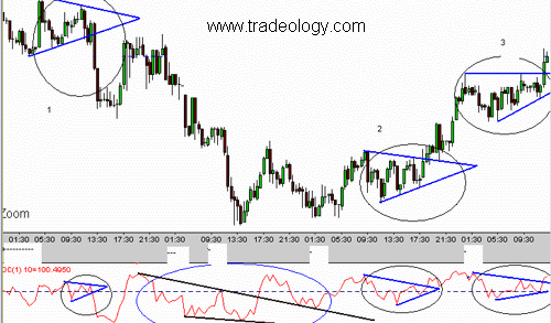
Looking at the chart example, the first thing we notice about the ROC is that it contracts when price is in consolidation and expands when price has volatility.
In short, we can anticipate a volatile move to occur after the ROC has narrowed.
This is the reason, as we mentioned before, ROC is chosen, since it reflects the change first as it moves out of its own consolidation pattern. It can also give us an early warning of a pending move or confirmation of a move.
Try this - identify a narrowing ROC on a chart by drawing trendlines and then look at the corresponding candlestick chart pattern. If you see a triangle setting up on the candlestick chart you have a nice setup forming.
While the type of triangle is irrelevant at this stage, the triangle is a consolidation pattern with the support and resistance lines moving towards each other to form a point. The price range is limited and decreases as price moves to the point of the triangle. Shortly after it reaches the point there should be a breakout.
If we observe the first example (marked as the black circle.1), I first identified the narrowing ROC and plotted the support and resistance lines on it. Subsequently, the support and resistance lines were plotted on the candlestick chart, which gave us a symmetrical triangle. The breakout of the ROC from its consolidation gave us an early warning of the direction of the price breakout.
Similarly, the second example (marked as the black circle.2), also gave us a symmetrical triangle with the ROC breaking out to the upside first. In this case, the up move was further confirmed when the ROC line pulled back after the breakout and found support on its own line of resistance. This was followed by candlestick chart exhibiting the similar trend.
In the third example (marked in the black circle.3) we have an ascending triangle.
In this case we can observe that ROC also formed a triangle. The price did not initially go into consolidation but did subsequently form a broad ascending triangle. While the breakout of an ascending triangle is usually on the upside, the ROC broke out of its range first to give us the market direction. So what we have done is use the consolidation of the ROC to help identify potential set up’s for trades. We only look at situations when the support and resistance lines drawn on the ROC are moving towards each other causing the ROC to narrow. We ignore the other situations, such as the one marked in the blue circle. In this case, even though the ROC was consolidating the support and resistance lines were not moving towards each other. They were not forming a triangle but a channel, which does not fit in our parameters of a setup. Hence we ignored this setup. You could however use the ROC trendline to give you an early indication of a change in trend. |
|
As you can see in the blue circle, price broke through the ROC trendline, which eventually became support. Plotting trendlines on indicators can often give you a different picture or advance warning of something about to happen.
Good Trading
Download PDF Version For Printing
Right Click and "Save Target As"
Information, charts or examples contained in this lesson are for illustration and educational purposes only. It should not be considered as advice or a recommendation to buy or sell any security or financial instrument. We do not and cannot offer investment advice. For further information please read our disclaimer.