The general rule of thumb is, when the MACD rises above the signal line the bulls are in control. And conversely, when the MACD drops below the signal line, we look for an opportunity to sell. Greater credibility is given to the bulls/bears when the two lines cross above/below the zero line – conservatively speaking.
I say this because often times at OB levels, depending on support and resistance (S/R), Bollinger Band Reversal signals, Fibonacci, etc., the MACD can make a bearish cross (or in the case of the MACD Histogram – a bearish drop) giving great shorting opportunities despite the fact the MACD is way into bullish territory – the opposite being true for OS levels.
Knowing that lagging indicators can remain in OB/OS conditions for extended periods of time it is important to take note that these crossings provide us with potential entry signals; higher probability opportunities dictate that we look to other means for confirmation. |
An added bonus is provided to us through the MACD Histogram, which gives us a visual perspective of the difference between the MACD (the difference of two EMAs) and the third EMA (signal line).
As with any oscillator, the MACD or MACD Histogram can provide us with possible retracement or reversal opportunities when divergence is visable.
Charts
In trading the Forex and currency markets, if you are more of a position trader, in order to limit whipsawing you will find it advantageous to use the standard MACD setting of 12,26,9 or longer. As an intra-day trader, I have deviated from the default settings by shortening the moving averages (10,22,5) in order to provide a more responsive indicator.
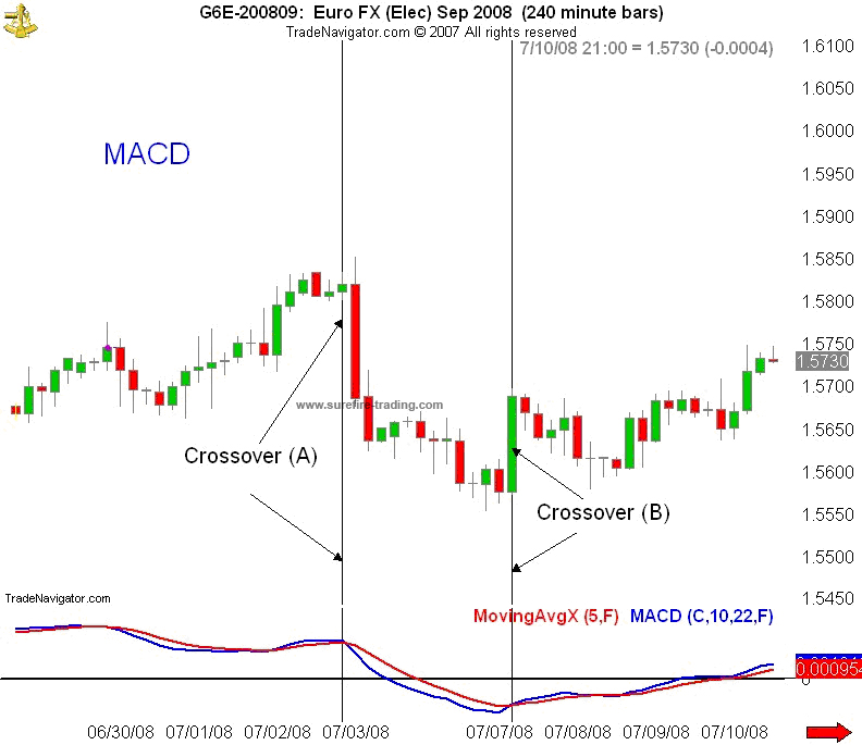
On the 4-hr. chart below, as the market began to drop we can see with Crossover (A), the MACD (blue line) moved below the signal line (red). In Crossover (B), as the price began to rise, the MACD moved above the red line. As the trend began to strengthen (bullish or bearish), the MACD pair crossed the centerline.
Also, take notice of the widening of the two lines. As with the Bollinger Bands, when the two MACD lines begin to widen or spread apart, this shows greater control of the dominant team (bulls/bears).
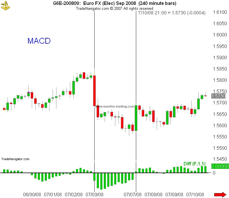
In the next chart, we have the MACD Histogram, which is contrastingly portrayed as bars. Similar to the MACD above, however, we see below that the bars of the Histogram cross the centerline as domination of one group weakens while the other group strengthens. In contrast to the MACD lines crossing, however, as the trend strengthens/weakens the bars increase/diminish in size.
In other words, as the bulls’ position weakened the bars not only diminished in size, they crossed below the centerline. Having crossed the centerline into bearish territory, as the bears take greater control of the market, the bars once again began to increase in size – which is nothing more than the equivalence of the MACD lines widening.
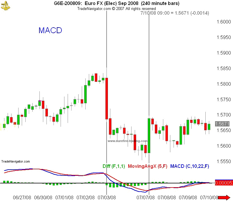
Now, when we put the two indicators together (below), we can easily see the relationship between the MACD lines and the MACD Histogram. The Histogram is on the bullish side of the zero line when the MACD (blue) is above the signal line (red) - and on the bearish side of the zero line when the MACD is below the trigger line.
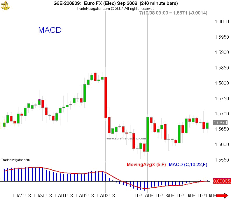
Now, some charting services do not permit you to display the MACD as two distinct lines. As with the chart below, the MACD is displayed as a histogram (not to be confused with the MACD Histogram) and a signal line. Plainly stated, the two MACD lines have been substituted with histogram bars.
Instead of two lines (the MACD and signal line) crossing each other, the signal line crosses the histogram. So, we have three ways to determine dominance:
• The crossing of the histogram and the signal line (or, if you prefer, the crossing of the MACD and the signal line)
• The size (or length) of the bars (or, the widening of the red and blue lines)
• Above or below the zero-line.
Basically, we have the same information provided with each – just a little different perception. So, if you have a choice, what it really amounts to is (from your perspective) which picture clearly depicts what is happening with the price action - which version of the MACD speaks the loudest to you.
We have now seen that the MACD is “merely” a combination of several EMAs either converging with each other or moving away divergently from each other at some point – thus the description, “Convergence/Divergence” - which raises the question, “Why not just place a 12 EMA and a 26 EMA (standard settings) on the price chart?” If you want to experiment a little, you will notice that the MACD doesn’t lag anywhere near as much as an EMA crossover – the MACD moves faster. And in our business a faster indicator is always a plus. This is precisely why I DO NOT use EMA crossovers to enter or exit the market; if you haven’t figured it out by now, you will see in time that MAs are best used for support and resistance.
Click To Play The Video
Click To Play The Video
So, what do you say boys and girls - let’s trade.
Access this 495.27% strategy absolutely FREE
If You Want To Learn How To Turn $150 Into $7,523.54 In under 30 Days With A Simple System
Enter your valid email for instant access:
|
|
|
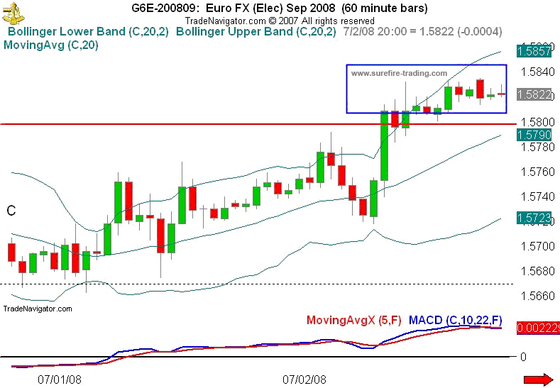
Trade Example
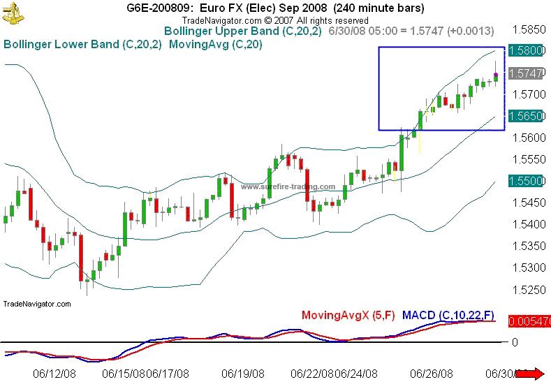
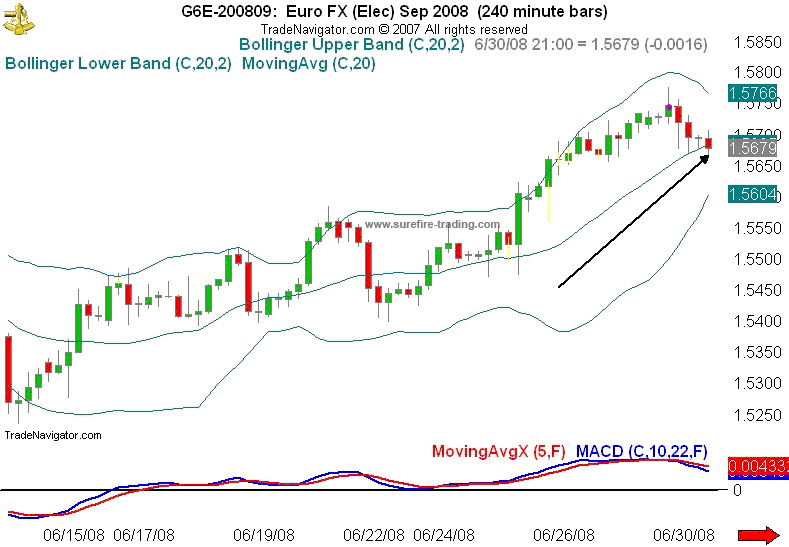
In this 4-hr. chart bellow, as usual, the BBs provide us with the initial signal. What do we see?
1) In the boxed-in area (A), we have an opportunity to short the market with our classic BB reversal signal; demonstrated by a close above the upper band, subsequently followed by multiple closes within the bands.
2) The MACD is beginning a bearish cross.
3) And it is positioned in overbought territory. Shorting this market looks good doesn’t it?
Is this a “high-probability” trade?
Are we able to make a determination by this chart? |
Remember, in order to get a clearer perspective, what is our first move? If this is, in-fact, a shorting opportunity – don’t we need confirmation of the trend? And we do this how? Or better asked, “Where?” Let’s go one time frame higher to the Daily chart.
What do we see?
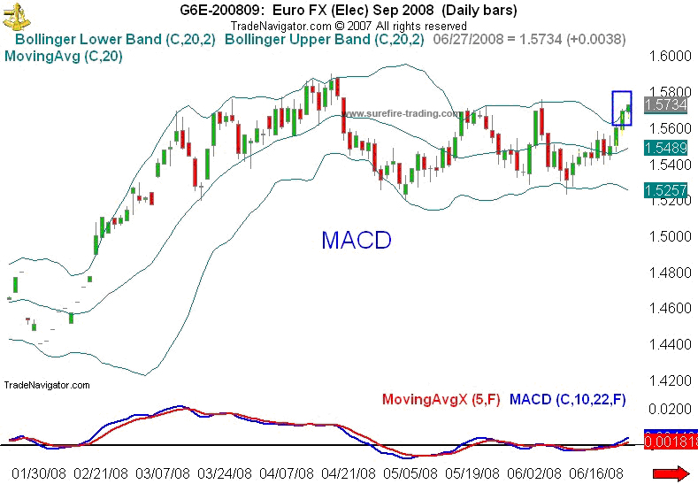
1) We have a bullish trend
2) We have consolidation (market is ready for a breakout)
3) MACD has made a bullish cross
4) MACD has broken above the zero line into bullish territory
So, let’s expand the Daily chart in order to get an even greater perspective.
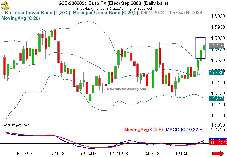
Now, what do we see?
1) Consolidation is obvious.
2) We have two closes above the upper band
3) And MACD indicates that the bulls dominate
Are we still looking for an opportunity to short this market?
NOT……………
We are looking for an opportunity to enter in a bullish direction. This would be a high probability trade.
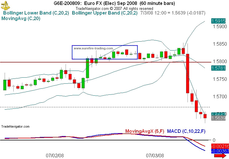
Remember, we buy the dips and sell the rallies. So, if we are looking to go long, we are looking for what, specifically? A retracement. So, let’s go back to the 4-hr. chart and wait for a pullback.
|
- The market has pulled back to the 20 SMA
- MACD has crossed but remains in bullish territory
this is a good place to start. We will now drop down to a 60-min. chart to find our entry.
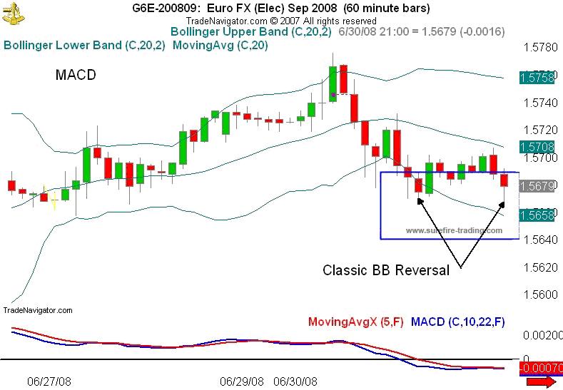
In the chart above, we see that we have a reversal signal; so, let’s pinpoint the entry.
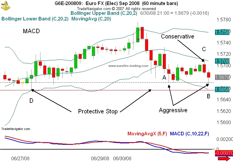
In the chart above, we have an aggressive entry at the BB Reversal signal or we can enter more conservatively a few pts. above candle (C) – placing our protective stop, immediately below candle (D) or below the lower Bollinger Band.
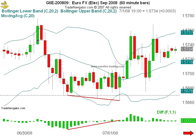
As the price began to move in our favor (below), a trailing stop would move upward just below the lower BB….just as long as the MACD remained in bullish territory.
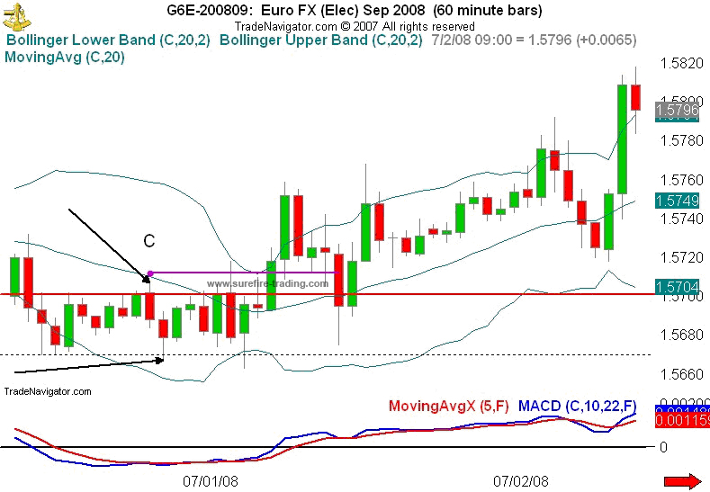
A Classic BB Reversal signal confirmed with a crossing of the MACD (below) brings my stop higher – or conservatively, I could exit at this point.
The next two hours prove, once again, the importance of protective stops (below). If you had not followed the market with a trailing stop, you would have exited at your original stop – with a loss…. a minor loss, non-the-less, a loss. As it is, sound-trading tactics provided us with a profitable day.
Now, when it comes to trading divergence, my personal preference is the MACD Histogram. The chart below is where we originally entered the market – except I have exchanged the MACD indicator for the MACD Histogram. As you may be able to see, in addition to the BB Reversal signal, we have great bullish divergence.
With Surefire-trading.com, this is Ty Young, reminding you to “Read the Charts” :o)
|